Hello, Inistate Community! ![]() Want to make sure your listings look stunning on both mobile and tablet devices? Here’s a quick guide to setting up your listing views for various screen sizes and orientations (S, M, L) in both portrait and landscape modes.
Want to make sure your listings look stunning on both mobile and tablet devices? Here’s a quick guide to setting up your listing views for various screen sizes and orientations (S, M, L) in both portrait and landscape modes. ![]()
Goal:
Guide Workspace Owners on how to configure listing views for various screen sizes (S, M, L) on mobile and tablet (iPad), in both portrait and landscape orientations.
Description:
Creating a seamless and visually appealing experience across devices is essential. Inistate allows Workspace Owners to customize listing views for different screen sizes (S, M, L) and orientations on both mobile and tablet platforms. This guide walks you through setting up listing views in Details View and Grid View, specifically for smartphones and iPads.
Prerequisite: Enable Design Mode (available for role Workspace Owner ONLY)
May refer how to enable Design Mode here ![]()
 Mobile View Settings
- Details View (S, M, L)
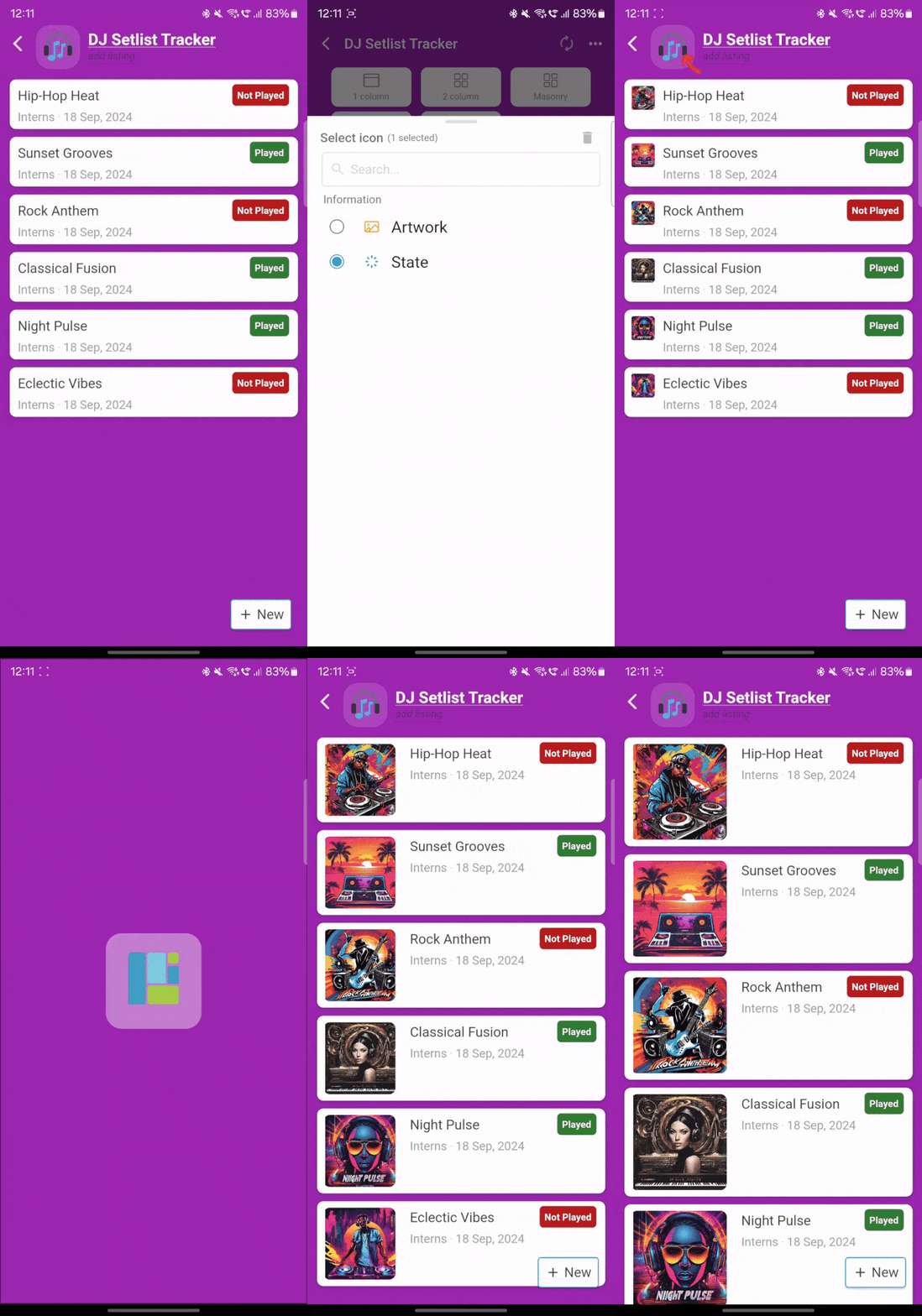
- Check out the Mobile details view gif to see how your listing looks in the details view on mobile.
- Make sure to adjust the sizing for each option (S, M, L) to ensure the content fits beautifully on smaller screens.
-
 Tip: Use smaller text and images for the “S” size, medium-sized elements for “M,” and slightly larger elements for “L” to optimize the experience.
Mobile details view gif

- Grid View (S, M, L)
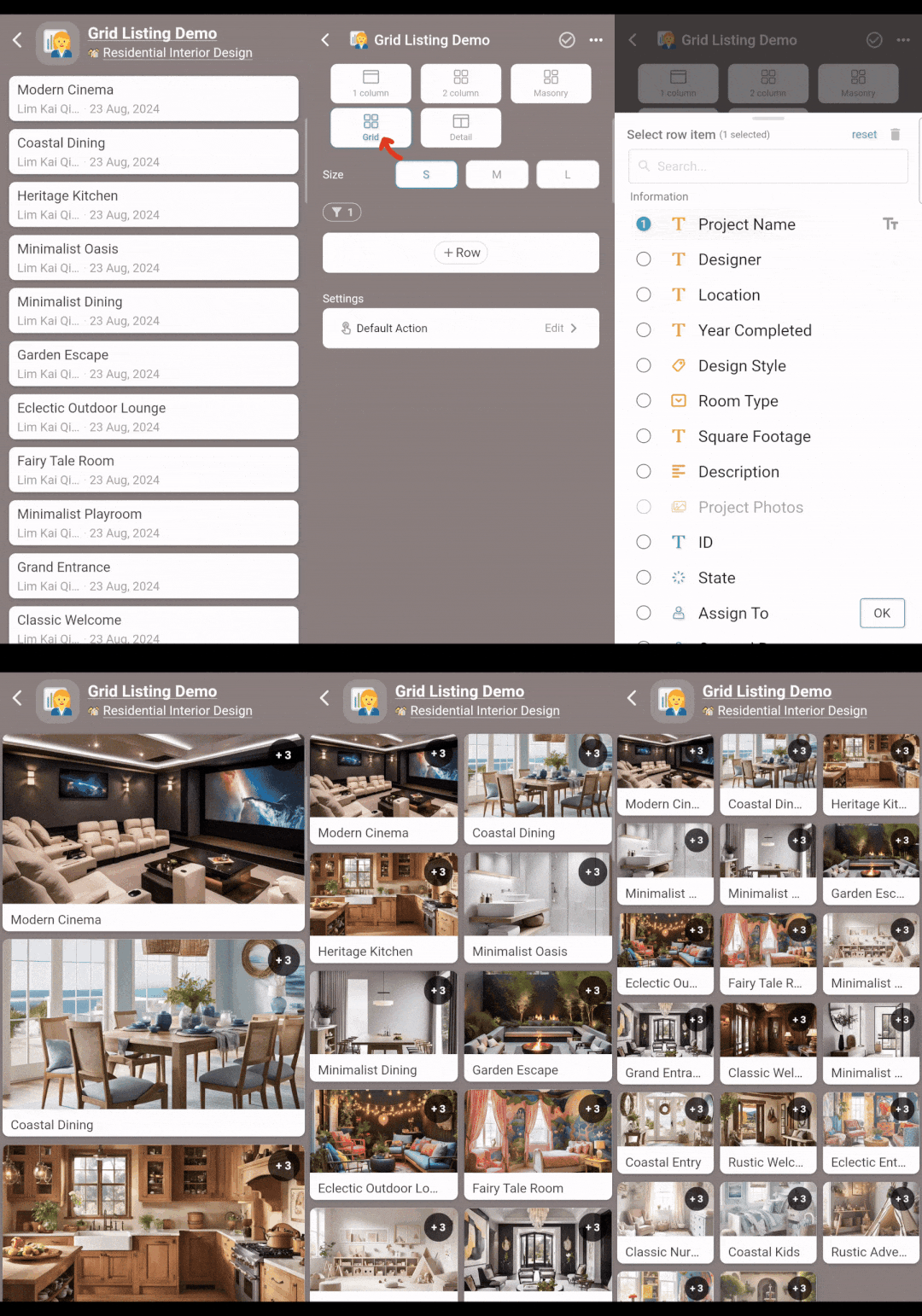
- Refer to 2.gif for the grid view layout.
- Keep in mind that “S” is perfect for compact grids with minimal content, while “L” provides a more spacious look.
-
 Tip: Choose grid settings that allow users to easily browse and find items.
Mobile grid view gif

 iPad View Settings
- Grid View (S, M, L)
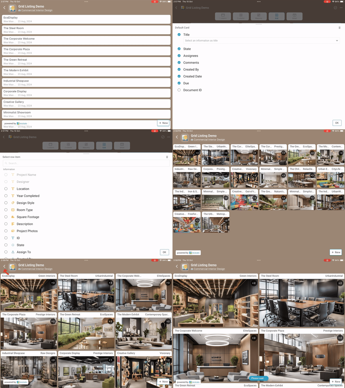
- Watch iPad grid view gif for a preview of the grid view on the iPad.
- With a larger screen, you can take advantage of more space by showing extra information or larger images.
-
 Tip: When switching between portrait and landscape, ensure the content remains well-organized and aesthetically pleasing.
iPad grid view gif

- Details View (S, M, L)
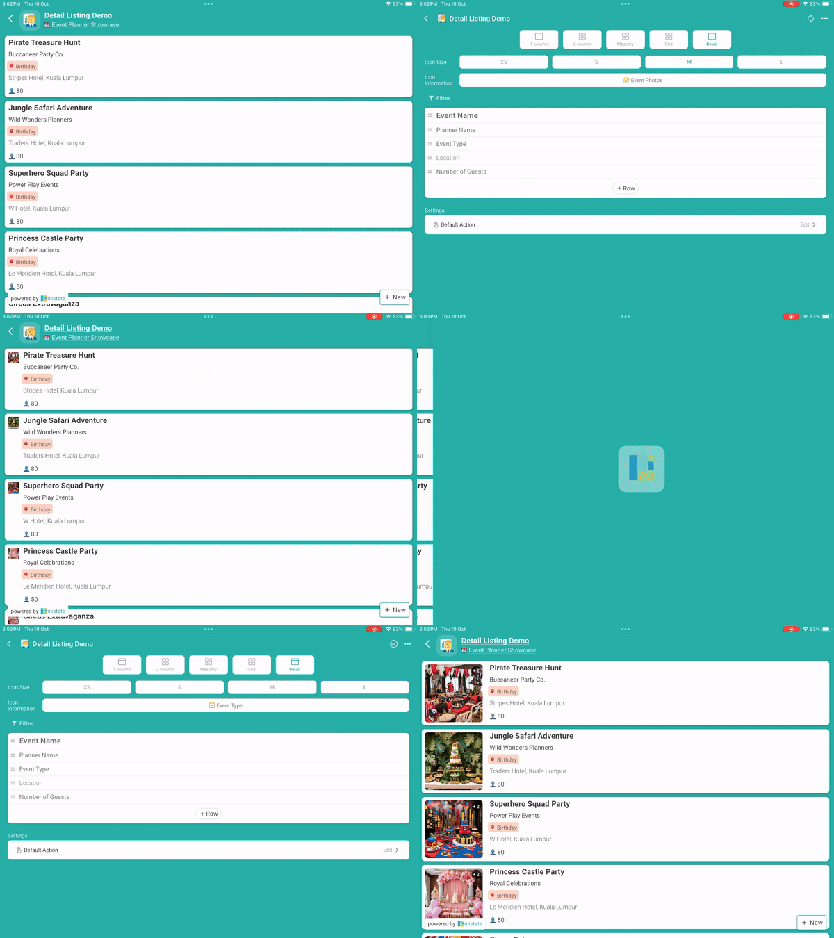
- The iPad details view gif shows the iPad details view.
- Make sure to tweak the layout for different screen sizes (S, M, L) and orientations, so your listings are accessible and visually appealing.
-
 Tip: Use dynamic resizing features to adjust the content seamlessly between portrait and landscape modes.
iPad details view gif
