Hi inistate community ![]()
Goal:
To introduce users to the latest user interface (UI) updates, highlighting new features that improve clarity, usability, and visual experience in the Inistate app.
Description:
The recent update to Inistate brings a refreshed look and feel to the listing and form view screens. The design changes focus on reducing visual clutter, streamlining interactions, and enhancing mobile usability with gesture-based features. Inspired by modern app interfaces, these changes make navigating and viewing records more efficient and pleasant.
What’s new?
![]() Click to view content
Click to view content
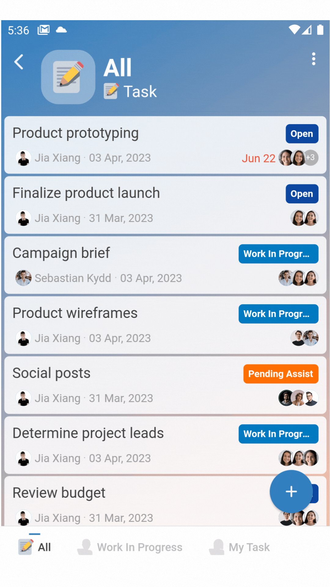
Listing user interface and experience
We simplify the list entry UI without omitting important details, focus on minimizing visual clutter.
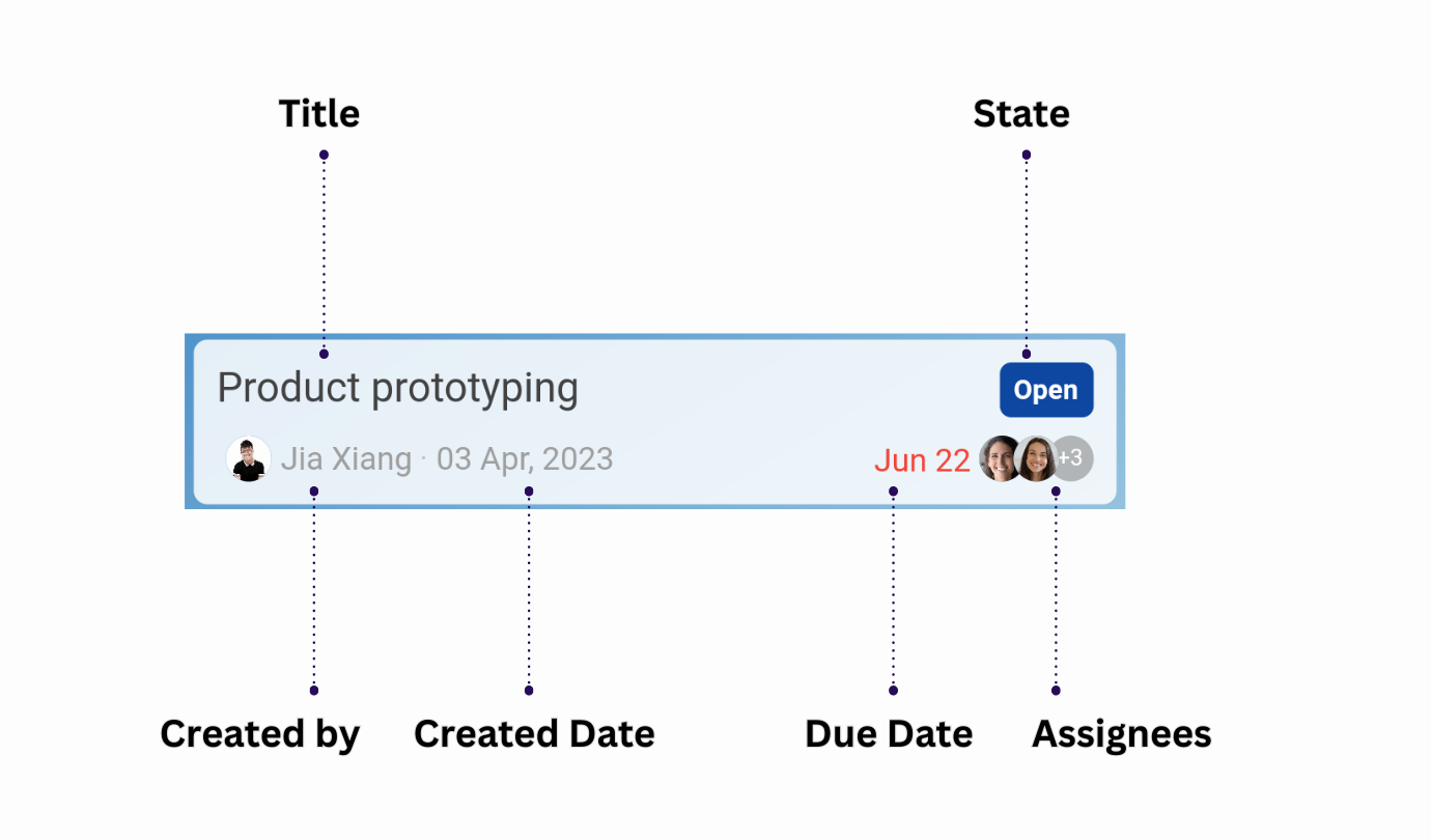
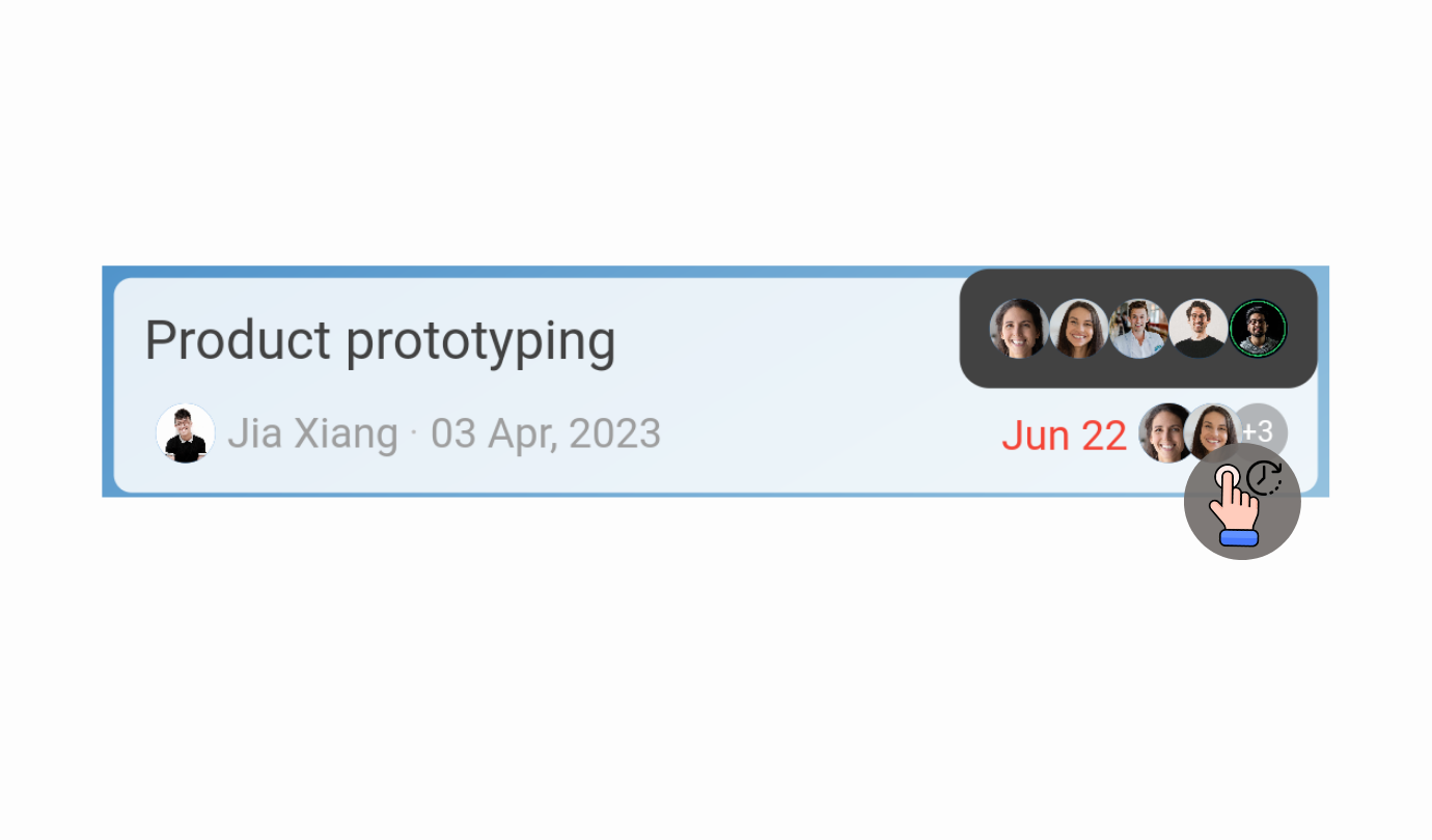
Besides, we allowing a long press to reveal state text.

And, show a maximum of three avatars with a long-press option to view more if available.
More
Inspired by iOS WhatsApp
Our new user interface elegantly hides some details by default for a cleaner interface. You can slide down to reveal it!
![]()
![]()
![]()
![]()
![]()
![]()
![]()
![]()
![]()
![]()
![]()
![]()
![]()
![]()
![]()
![]()
![]()
![]()
![]()
![]()
![]()
![]()
![]()
![]()
![]()
Tips / Notes:
- Try out the long press gesture on both list entries and avatars to discover the new hidden features.
- The drag down to reveal interaction is especially useful on mobile devices.
- These changes do not affect existing workflows or automation—only the visual presentation.
- Share your feedback in the community to help us refine future UI updates.
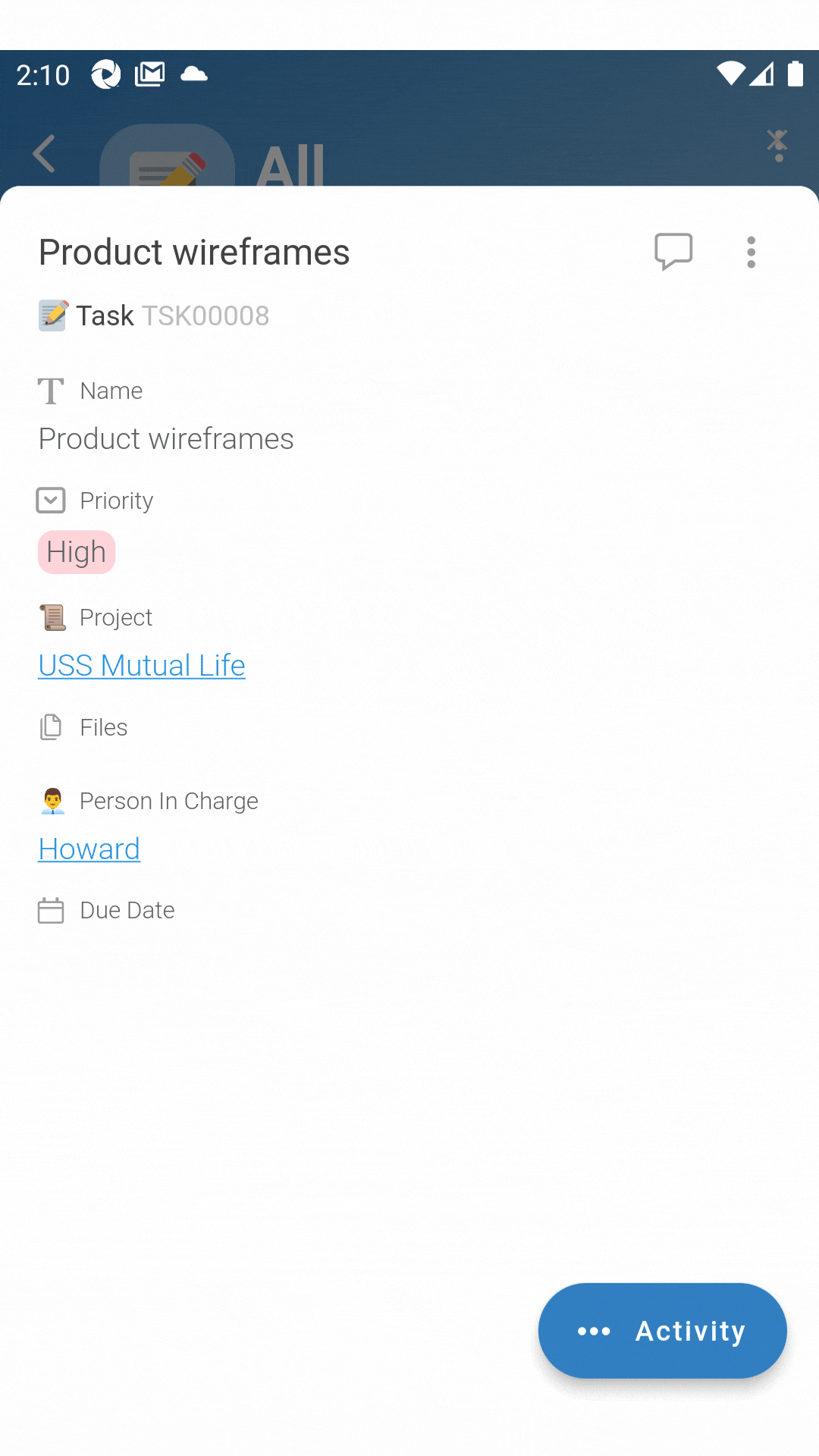
Discover the fresh updates in our new form view - a myriad of exciting changes await your exploration!
![]() What are your thoughts on the recent changes?
What are your thoughts on the recent changes?
- Like it !
- It’s Okay.
- Could be better.
0 voters